Creating a metal logo isn’t just about looking aggressive — it’s about capturing your band’s identity, genre, and attitude in one powerful visual. Whether you’re into black metal, deathcore, thrash, or doom, these five tips will help you design a logo that hits hard and stands out.
1. Understand Your Subgenre’s Aesthetic
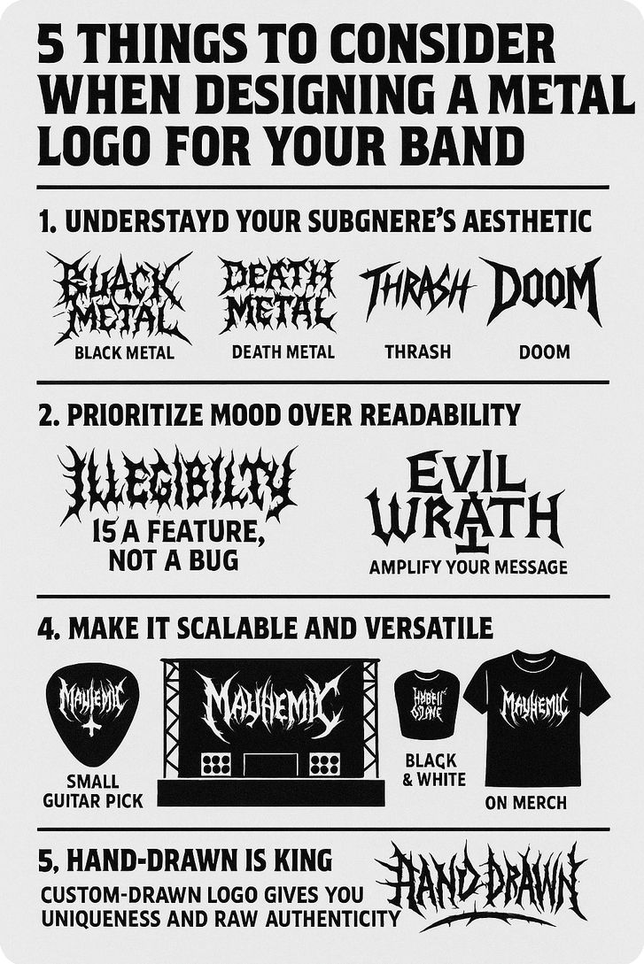
Each metal subgenre has its own visual language.
- Black Metal = spiky, chaotic, often unreadable
- Death Metal = organic, twisted, decaying forms
- Thrash = sharp, energetic, sometimes graffiti-inspired
- Doom = slow, heavy, often Gothic or vintage
👉 Match the style of your logo with the sound of your music.
2. Prioritize Mood Over Readability
In metal, illegibility is a feature, not a bug. A great logo should feel raw, evil, or epic — even if it takes a few seconds to read.
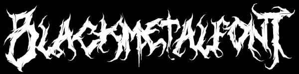
Still, if you want better readability while keeping that dark edge, you can use a black metal-style font from BlackMetalFont.com — perfect for balancing legibility with brutal vibes.
⚠ But don’t go too far: there’s a balance between mystery and confusion.
3. Use Symbols Wisely
Skulls, inverted crosses, wolves, sigils, swords — the right symbol can amplify your message. But use them intentionally.
✔ Ask yourself: does this symbol reflect your lyrics, your message, or your band identity?
4. Make it Scalable and Versatile
Your logo should look good:
- on a small guitar pick
- on a massive stage backdrop
- in black & white or on merch
🎯 Avoid thin lines that disappear when scaled down.
5. Hand-drawn is King
Digital fonts can be a shortcut, but a custom-drawn logo gives you uniqueness and raw authenticity.
It shows that your band is serious — and has its own soul.
✍️ Hire an artist (or draw it yourself) to capture the chaos, grit, and glory of your band.